Introduction
With the advancements in technology and the constant changes that occurs in the web development landscape, it is of great importance for web developers to master frameworks that enhance efficiency and responsiveness. The highly regarded front-end framework Bootstrap enables programmers to design aesthetically attractive and fluidly responsive web applications. In the ever-evolving landscape of web design and development, being abreast and having a fair understanding of Bootstrap and its particulars is essential, irrespective of your experience level as a developer. With the demand for professionals in the field comes the need to be well prepared to face any interview in order to land the job. In this regard, practicing with Bootstrap interview questions helps you become more technically proficient while also revealing your level of confidence in using this potent framework. This is why this article has put together 30 of the most asked bootstrap interview questions with relevant answers to help potential candidates harness the full potential of this framework and be able to ace any interview they are called for.
Introduction to Bootstrap: Basic bootstrap interview questions
- Q1: What is Bootstrap and why is it used in web development?
This is one of the most asked bootstrap interview questions and it also opens the path for the interview to begin. Bootstrap, an open-source front-end framework, provides HTML, CSS, JavaScript, and a grid system to make web development easier. Its primary advantages are community support, extensive documentation, customization capabilities, responsive design, fast development, consistency across browsers, and a mobile-first strategy. Bootstrap's pre-designed components offer a consistent user interface and its grid system allows for flexible layouts. Because of its mobile-first strategy, web applications are guaranteed to be mobile-friendly.
- Q2: Can you explain the Bootstrap grid system?

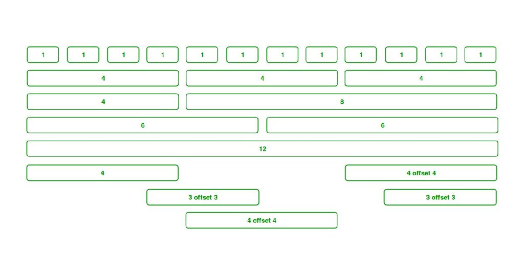
The Bootstrap grid system is a 12-column layout structure for web development, allowing developers to create adaptable and visually appealing designs across various screen sizes and devices. It creates 12 equal-width columns in the layout, and rows hold these columns in place. Column widths within a row are specified by predefined classes, and breakpoints allow the grid system to adapt to varying screen sizes.
- Q3: What are the key features of Bootstrap?

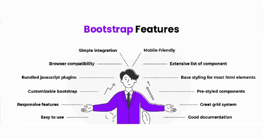
This is also one of the frequently asked bootstrap interview questions. Bootstrap, as a popular front-end framework has many features, including cross-browser compatibility, responsive design, flexible grid system, pre-designed components, customization options, lots of documentation, community support, themes and templates, Flexbox utilities, and utility classes.
- Q4: How does Bootstrap differ from CSS frameworks?

While the approach and degree of abstraction of the Bootstrap and CSS frameworks are similar, their scope, component libraries, JavaScript integration, customization, learning curve, and file sizes are different. Although CSS frameworks are typically lower-level and concentrate on styling, Bootstrap is a high-level front-end framework with an extensive set of components and functionality. While CSS frameworks usually offer a more basic set of styles and utilities, Bootstrap's extensive component library enables developers to quickly build interfaces without having to create every element from scratch.
- Q5: What are Bootstrap containers?
To create responsive layouts, bootstrap containers are necessary because they give rows and columns a structured environment. Fixed-width containers, which are centered on the page, and full-width containers, which fill the viewport, are the two primary varieties. Developers can select any of these according to design objectives.
Bootstrap interview questions on components and grid system
- Q6: How do you create a responsive layout using the Bootstrap grid?
The Bootstrap grid system can be used to create a responsive layout by including the Bootstrap CSS file, creating a container, adding rows, inserting columns, using responsive breakpoints, creating nested rows and columns, and adjusting column widths at different screen sizes using responsive breakpoints. This ensures an optimal viewing experience across various devices.
- Q7: Describe the use of Bootstrap tables.
Bootstrap offers a range of CSS styles and classes to improve the appearance and functionality of HTML tables. Basic table structure, striped rows, hover rows, bordered tables, condensed tables, responsive tables, contextual classes, and active and inactive rows are some examples of these styles. These options enhance the aesthetics and usability of HTML tables.
- Q8: What are Bootstrap cards and how are they used?
A lightweight container element called a bootstrap card is used to present text, images, and links in an aesthetically pleasing way. With options for titles, text, images, links, buttons, list groups, background colors, and shadows, they are composed of a header, body, and footer. They offer responsive design, flexibility, modularity, and customization options, making them a valuable tool for building user interfaces and visually appealing sections on webpages.
- Q9: Can you explain the purpose of Bootstrap navigation bar?
An essential part of the Bootstrap framework, which makes responsive and easily navigable headers for websites, is the Bootstrap navigation bar. It facilitates responsive navigation, structure layouts, and includes a collapsible mobile menu. Additionally, dropdown menus, multiple styling and theming options, and brand identification are supported. Additionally, functional elements like buttons or search boxes can be added to the navigation bar.
- Q10: How do you customize Bootstrap components?
Customizing Bootstrap components allows you to customize their appearance and behavior to suit your project's design requirements. Custom JavaScript can be used to extend functionality, Sass files can be used to override variables, custom CSS can be used to override default styles, and custom classes can be added to components. Bootstrap Themes can be used to select or create themes. Because of their adaptability, Bootstrap elements will blend in perfectly with the overall style and aesthetic of your web project.
Bootstrap Interview Questions on Customization and Integration
- Q11: How can Bootstrap be customized using SASS?
This is one of the frequently asked Bootstrap interview questions. Customizing Bootstrap using Sass is a flexible and powerful way to modify the default styles and behavior of Bootstrap components. The Preprocessor scripting language Sass can be compiled or interpreted into CSS. To use Sass to customize Bootstrap, take the following actions: Install Sass, make a Sass file, modify Bootstrap variables, compile Sass to CSS, link the resulting HTML, modify components one more, recompile, and test the changes.
- Q12: Can Bootstrap be used with Angular or React?
Bootstrap is a front-end framework that can be used with Angular and React to create visually appealing user interfaces. Both frameworks can be easily integrated to improve the user experience and are well-liked for creating single-page applications (SPAs). Installing Bootstrap with npm, including JavaScript and Bootstrap styles, and using Bootstrap components in Angular components are the steps involved in integrating it with Angular.
- Q13: How do you override default Bootstrap CSS styles?
Applying custom styles to change or replace the default appearance of Bootstrap components is known as overriding default Bootstrap CSS styles. Find the target component, make a custom CSS file, and replace the default styles to accomplish this. As an alternative, you can override specific components and Bootstrap variables using Sass. Create a CSS file by composing the Sass file and linking it to the HTML document. Make sure that in the stylesheet order, your custom styles are applied after the Bootstrap styles.
- Q14: What is the role of Bootstrap variables?
Placeholder values for the framework's style definitions are found in bootstrap variables. They make maintenance simple, allow developers to easily alter the appearance and feel of their applications, and preserve a unified design language. Additionally supporting responsive design are variables, which are made possible by the SASS preprocessor. They also make Bootstrap highly extensible, ensuring flexibility and adaptability for web development projects.
- Q15: How do you integrate a Bootstrap theme into an existing website?
The following procedures can be used to integrate a Bootstrap theme into an already-existing website: choose a theme, download and unpack the theme files, link the CSS and JavaScript files of the theme, modify the HTML markup, test and improve, and resolve any conflicts. To customize the theme, consult the documentation, make a backup of your project files, and look for any additional dependencies. With little effort, this procedure can update the UI and visual style.
Bootstrap interview questions on responsive design
- Q16: How does Bootstrap support responsive web design?
Bootstrap interview questions like this on responsive design is to be expected. Bootstrap is a web design framework that supports responsive web design by incorporating flexible grid layouts, responsive utility classes, and built-in media queries. A 12-column grid system, media queries, responsive images, responsive typography, responsive navigation bar, and responsive utility classes are some of the main features. These features enable websites to adapt to different screen sizes and devices, ensuring efficient and user-friendly interfaces without the need for separate designs for different device types.
- Q17: What are Bootstrap breakpoints?
Bootstrap breakpoints are specific points in the screen width where a website's layout changes to accommodate different device sizes. They are crucial for creating responsive web designs, allowing developers to define how elements should adapt as screen size changes. Key breakpoints include Extra Small (xs), Small (sm), Medium (md), Large (lg), and Extra Large (xl). Understanding and utilizing these breakpoints helps create visually appealing responsive designs across various devices.
- Q18: How do you use Bootstrap’s responsive utility classes?
Bootstrap interview questions are never complete without a question like this. Web design can be responsive to different screen sizes thanks to Bootstrap's responsive utility classes. These classes set the visibility, hiding, and alignment of elements according to screen or device width. D-none, d-md-none, display, alignment, text, spacing, ordering, and offset classes are a few examples. These classes enhance user experience and ensure a well-functioning website across various platforms.
- Q19: Explain the concept of mobile-first design in Bootstrap.
This is one of the few interesting bootstrap interview questions. Prioritizing the development of websites for mobile devices over those for larger screens is known as mobile-first design. This is the method used by the well-known front-end framework Bootstrap, which has progressive enhancements for larger screens and default styles meant for small screens. A viewport meta tag, a mobile-first grid system, responsive utility classes, and component responsiveness are some of the fundamental ideas. This approach ensures websites are accessible and user-friendly across various devices.
- Q20: How do you handle image responsiveness in Bootstrap?
Bootstrap's image responsiveness is crucial for creating mobile-friendly web designs. Important methods include using image alignment classes, w- and h-classes to control image sizes, and the img-fluid class to make images scale with their container. The alignment and size of images can also be managed with grid systems. Test designs on different devices for optimal results.
Bootstrap interview questions on bootstrap JavaScript components
- Q21: What are some of Bootstrap’s JavaScript plugins?
This is one of the frequently asked Bootstrap interview questions on JavaScript components. A variety of JavaScript plugins are available from Bootstrap to improve the functionality and interactivity of web pages. Modals, dropdowns, tooltips, popovers, collapse, carousels, scrollspy, alerts, tabs, and collapse are some of these plugins. They work seamlessly with Bootstrap components, providing a rich set of features for common UI elements. These plugins contribute to a more dynamic and interactive user experience, allowing developers to incorporate them into their projects without writing complex JavaScript code.
- Q22: How do you use modals in Bootstrap?
Pop-up dialog boxes that overlay the current page are created by Bootstrap modals. To use modals, import Bootstrap files, make a button to open the modal structure, add JavaScript to close it, and use the modal itself. To show more information or interactive content, alter the modal's appearance, content, and structure.
- Q23: Can you explain how to implement a carousel using Bootstrap?
Include the required Bootstrap files, build the carousel structure, add navigation controls, configure indicators, use JavaScript to activate the carousel, and modify the interval option to create a basic carousel in Bootstrap. Customize content, styles, and options based on your specific requirements. he designated slides will be automatically switched between by the carousel.
- Q24: What is the purpose of Bootstrap’s collapse plugin?
Bootstrap's Collapse plugin creates collapsible and expandable content sections on webpages, allowing users to control visibility with a toggle effect. Bootstrap's Collapse plugin are used for collapsible panels, accordion-style menus, and interactive content displays. The plugin's design prioritizes accessibility, seamless transition effects, responsive layouts, and customizable options. It contributes to a dynamic and responsive user interface by improving information organization and interactivity.
- Q25: How do you customize Bootstrap’s JavaScript components?
Including the required files, modifying the HTML structure, employing data attributes, initializing them with JavaScript, personalizing settings, listening to events, and overriding styles with custom CSS are all part of customizing Bootstrap's JavaScript components. These steps help align the components with your project's design and functionality requirements, ensuring that you refer to the official documentation for each component's available options and possibilities.
Bootstrap interview questions on advanced topics
- Q26: What are the new features in Bootstrap 5?
Concerning Bootstrap 4, Bootstrap 5 added several new features. These included the ability to modify color schemes, an enhanced grid system, utility classes, new components, updated documentation, support for RTL languages, improved accessibility, a simplified navbar, and updated icons. he framework also introduced new utility classes for spacing, sizing, and responsiveness, and added new components like accordion, off-canvas navigation, and range input.
- Q27: How does Bootstrap handle accessibility?
The "badge" component of bootstrap is used to visually represent extra information in a user interface, such as counts, notifications, or statuses. It contributes to the visual hierarchy, provides contextual information, and can be easily integrated into various components. In addition to being aesthetically pleasing and adaptable, badges are made to be accessible so that everyone can use and see them, including people with impairments.
- Q28: What are the best practices for optimizing Bootstrap’s performance?
Customizing components, reducing the number of CSS and JavaScript files, loading only necessary components, employing a Content Delivery Network (CDN), turning on compression, optimizing images, utilizing lazy loading, putting appropriate caching strategies in place, preconnecting to external domains, delivering essential CSS, optimizing fonts, and routinely testing and monitoring performance can all help to maximize Bootstrap's performance. These practices ensure faster and more responsive web applications, reducing latency and enhancing user experience. Performance bottlenecks can be located and addressed with the aid of routine testing and optimizations.
- Q29: How do you ensure cross-browser compatibility in Bootstrap?
Cross-browser compatibility is crucial for delivering a consistent user experience across different web browsers. Bootstrap, a popular front-end framework, is made to work with different types of browsers. The use of vendor prefixes, browser reset styles, testing across multiple browsers, utilizing Bootstrap documentation, Modernizr for feature detection, polyfills for features lacking, progressive enhancement, conditional comments for older Internet Explorer versions, frequent Bootstrap updates, and cross-browser testing tools are some examples of best practices.
- Q30: What are some common challenges when using Bootstrap and how do you overcome them?
This brings us to the end of our bootstrap interview questions. Although Bootstrap is a strong front-end framework, developers may encounter issues with overhead, file size, customization restrictions, compatibility with multiple browsers, beginner learning curve, responsive design difficulties, consistency in design, JavaScript dependency, and flexibility maintenance. Developers can overcome these by learning the Bootstrap grid system, ensuring design consistency, maintaining flexibility by using the most recent version of Bootstrap, incorporating additional libraries, testing applications in multiple browsers, customizing CSS, and using the Bootstrap customization tool.
Conclusion
By becoming proficient with the top 30 Bootstrap interview questions in 2024, Web developers are able to demonstrate their knowledge of this popular front-end framework. These carefully selected Bootstrap interview questions delve into the intricacies of bootstrap, equipping candidates with the needed knowledge and confidence to ace any bootstrap interview. Keeping current with updates on Bootstrap and engaging in hands-on coding practice helps developers succeed in interviews and make valuable contributions to projects that make use of Bootstrap's capabilities.


